format:
  html: default
pdf: defaultShowcase your inner data scientist
Pick a dataset, any dataset…
May be too long, but please do read
Overview
The final project for this class will consist of analysis on a dataset of your own choosing and an interactive data visualization. Your group can choose the data based on your interests or based on work in other courses or research projects. The goal of this project is for you to demonstrate proficiency in the techniques we have covered in this class (and beyond, if you like) and apply them to a novel dataset in a meaningful way. Thus, I will want you to choose data that requires some cleaning.
The goal is not to do an exhaustive data analysis i.e., do not calculate every statistic and procedure you have learned for every variable, but rather let me know that you are proficient at asking meaningful questions and answering them with results of data analysis, that you are proficient in using R, and that you are proficient at interpreting and presenting the results. You could discuss why you make certain description in your analysis to be an ethical data scientist.
The project is very open ended. You should conduct an investigation of the data, investigate variables, and searching for new insights. You should also create at least one very compelling visualization to can be used to shed light on your research question and make it interactive. You not required to fit any advanced statistical models but perform a through descriptive investigation using R and convey they results in a meaningful way.
There is no limit on what tools or packages you may use, but sticking to packages we learned in class (tidyverse) is recommended. If you decide to do something with mapping you will likely need to use new packages. You do not need to visualize all of the data at once. A single high quality visualization will receive a much higher grade than a large number of poor quality visualizations. Also pay attention to your presentation. Neatness, coherency, and clarity will count. All analyses must be done in RStudio, using R.
Deliverables and Due Dates
- Data picked - due 3/26 end of afternoon class.
- Data cleaned - due 3/28 end of afternoon class.
- EDA, codebook, and static visualization - due 4/3 end of afternoon class.
- Interactive Visualization - due 4/9 end of afternoon class.
- Executive summary and Repo Organization - 4/10 start of morning class
- Presentation - 4/10 end of afternoon class
Data
In order for you to have the greatest chance of success with this project it is important that you choose a manageable dataset. This means that the data should be readily accessible and large enough that multiple relationships can be explored. As such, your dataset must have at least 50 observations and between 10 to 20 variables (exceptions can be made but you must speak with me first). The dataset’s variables should include categorical variables, discrete numerical variables, and continuous numerical variables. It should require some cleaning and I will help your group pick the data. Pick 3 options before our meeting.
Note on reusing datasets from class: Do not reuse datasets used in examples, homework assignments, or labs in the class.
On the useful links part of the website you will find a list of data repositories that might be of interest to browse. You’re not limited to these resources, and in fact you’re encouraged to venture beyond them.
We will meet in class and I will indicate which datasets you have I think will be appropriate.
Data Cleaning
This varies dramatically based on each groups project. You may need to: - Resolving NAs where possible - Clean column names - Creating new columns (such as binning age or splitting strings) - Combining datasets via stacking or joining - Pivoting columns (such as if years are across columns) - Summarize some columns
The end results should be a tidy dataset.
EDA and Static Visualization
Part 1 - Multiple Formats
I would like this submitted as an HTML and PDF. Add the following to the YAML of your qmd document that generates your EDA.
Part 2 - Data and Codebook
1) Place your data in the `/data` folder.
2) Print out the output of glimpse() or skim() of your data frame and add it to the README in the data folder.
3) Metadata: You have two ways you can present your metadata. Pick (a) or (b).
a) If your variable definitions were provided in a CSV, you don’t need to remake it. Update the metadata file or files. You either can have 1 metadata file that includes variables for all datasets in the folder OR a metadata file for each dataset in the folder. Name them appropriately. With this option, the readme includes much less, only a header and the result from (2).
b) Fill out the readme with all information requested including the result of the glimpse, a table of variable definitions, and anything else requested. You have to make a markdown table for this. The easiest way is to Google “create markdown table” and a free website will allow you to paste or type the information into an spreadsheet format, and then generate the markdown table for you. It is a time saver.
Part 3 - The EDA
Complete an exploratory data analysis (EDA) on the variables you are considering using for your project. For many groups this will be all available variables. Write up your EDA in Quarto document within your EDA folder of your project repository.
Section 1 - Introduction: The introduction should introduce your general research question and your data (where it came from, how it was collected,what are the cases, what are the variables, etc.).
Section 2 - Data analysis and plan:
This must include:
Exploratory data analysis, including some summary statistics and visualizations, along with explanation on how they help you learn more about your data.
This may include:
-   The outcome (response, Y) and predictor (explanatory, X) variables you will use to answer your question.

-   The comparison groups you will use, if applicable.

-   The method(s) that you believe will be useful in answering your question(s).

-   What results from these specific statistical methods are needed to support your hypothesized answer?
Section 3 - Static Visualization(s):
I am asking you to create one or more well polished visualizations with one or more of your variables that answers, or starts to shed light on your questions of interest. When you make this interactive later, you likely will be able to integrate more variables into one graph.
Each section should be no more than 500 words plus graphs.
| Total | 75 |
|---|---|
| Multiple formats | 5 |
| Data and codebook, organization | 30 |
| EDA, explored all relevant variables and includes discussion on all variables using graphs and table in the EDA. | 40 |
Interactive Visualization
This is the step where you take one or more of your static visualizations from your EDA and create either a dashboard with interactive visualizations or a visualization with multiple selectors/features that help a user visualize and understand the data you choose. I will be evaluating you on the following
| Total | 75 |
|---|---|
| Overall aesthetics | 25 |
| Utilization of the interactive features to enhance a readers/users ability to see and understand the data | 40 |
| Uniqueness/originality/extras | 10 |
Executive summary and Repo Organization
Along with your visual presentation, your team should provide a brief summary of your project in the README of your repository. This is a markdown file that can be opened and edited in RStudio. The executive summary should provide information on the dataset you’re using, your research question(s), your methodology, and your findings. Please make sure to use at least 400 words.
Example Repo organization
The following folders and files in your project repository:
README.md: Will contain your repository information, executive summary, and references with links/proposal OR data_cleaning: files for cleaning your data/data: Your dataset in CSV or RDS format and your data dictionary/EDA: Your project EDA files including a generated PDF (see EDA section)/update: Your first major update files/extra: Extra files you may use/presentation: Any files related to your presentation
Style and format does count for this assignment, so please take the time to make sure everything looks good and your data and code are properly formatted.
Presentation
You have 2 minutes, per person, maximum, and each team member should say something substantial. You need to discuss your data, an overview of your EDA, and your final visualization. Discuss your final visualization in the most detail, such as what interesting things it shows and why you chose the features that you chose. All graphical choices should have a reason.
Slide Option
You can create a Quarto presentation. Use File -> New File -> Quarto Presentation from within RStudio.
Dashboard Option
If you manage to house your entire project visualization inside of a Shiny dashboard, you will not need to create a separate set of slides or poster.
Virtual Poster Option
See website supplementary documents for a template.
Presentations will take place during the last day of class. During class you will watch presentations from other teams in class and provide feedback in the form of peer evaluations. See website supplementary documents. The presentation line-up will be in group number order (since that was random).
The professors grading scheme for the presentation is as follows:
| Presentation Rubric | 25 pts |
|---|---|
| Time management: Did the team divide the time well among themselves or got cut off going over time? | 2 pts |
| Professionalism: How well did the team present? Does the presentation appear to be well practiced? Did everyone get a chance to say something meaningful about the project? | 2 pts |
| Teamwork: Did the team present a unified story, or did it seem like independent pieces of work patched together? | 2 pts |
| Content: Did the team use impact visualizations and/or appropriate statistical procedures, and interpret the results accurately? | 10 pts |
| Are the slides/poster/visual well organized, readable, not full of text, featuring figures with legible labels, legends, etc.? | 9 pts |
Overall Grading
| Total | 300 |
|---|---|
| Data Meeting | 10 |
| Data Cleaning | 50 |
| EDA, Codebook, static graph | 75 |
| Interactive Visualization | 75 |
| Executive Summary,Reproducibility and organization | 40 |
| Professor Presentation Evaluation | 25 |
| Classmates’ presentation evaluation | 25 |
Team peer evaluation
You are to complete the assignment as a team. All team members are expected to contribute equally to the completion of this assignment and team evaluations will be given at its completion - anyone judged, by their teammates, to not have sufficient contributed to the final product will have their grade penalized. While different teams members may have different backgrounds and abilities, it is the responsibility of every team member to understand how and why all code and approaches in the assignment works. GitHub shows who submits changes and can also be used to see who participated. You will be asked to fill out a survey where you report a contribution percentage for each team member. If you are suggesting that an individual did less than 20% of the work, please provide some explanation. If any individual gets an average peer score indicating that they did less than 10% of the work, this person will receive half the grade of the rest of the group.
Formatting + communication tips
Suppress Code, Warnings, & Messages
- Your can add some options to the YAML of your document to do this.
eval: false,warning: falseare some options that might be of use.
Headers
Use headers to clearly label each section.
Inspect the document outline to review your headers and sub-headers.
References
Include all references in a section called “References” at the end of your main repo README.
This course does not have specific requirements for formatting citations and references.
Appendix
If you have additional work that does not fit or does not belong in the body of the report, you may put it at the end of the EDA document in section called “Appendix”.
The items in the appendix should be properly labeled.
The appendix should only be for additional material. The reader should be able to fully understand your report without viewing content in the appendix.
Resize figures
Resize plots and figures, so you have more space for the narrative.
Arranging plots
Arrange plots in a grid, instead of one after the other.
This is especially useful when displaying plots for exploratory data analysis and to check assumptions.
If you’re using ggplot2 functions, the patchwork package makes it easy to arrange plots in a grid.
See the documentation and examples here.
Plot titles and axis labels
Be sure all plot titles and axis labels are visible and easy to read.
- Use informative titles, not variable names, for titles and axis labels.
❌ NO! The x-axis is hard to read because the names overlap.
ggplot(data = mpg, aes(x = manufacturer)) +

  geom_bar()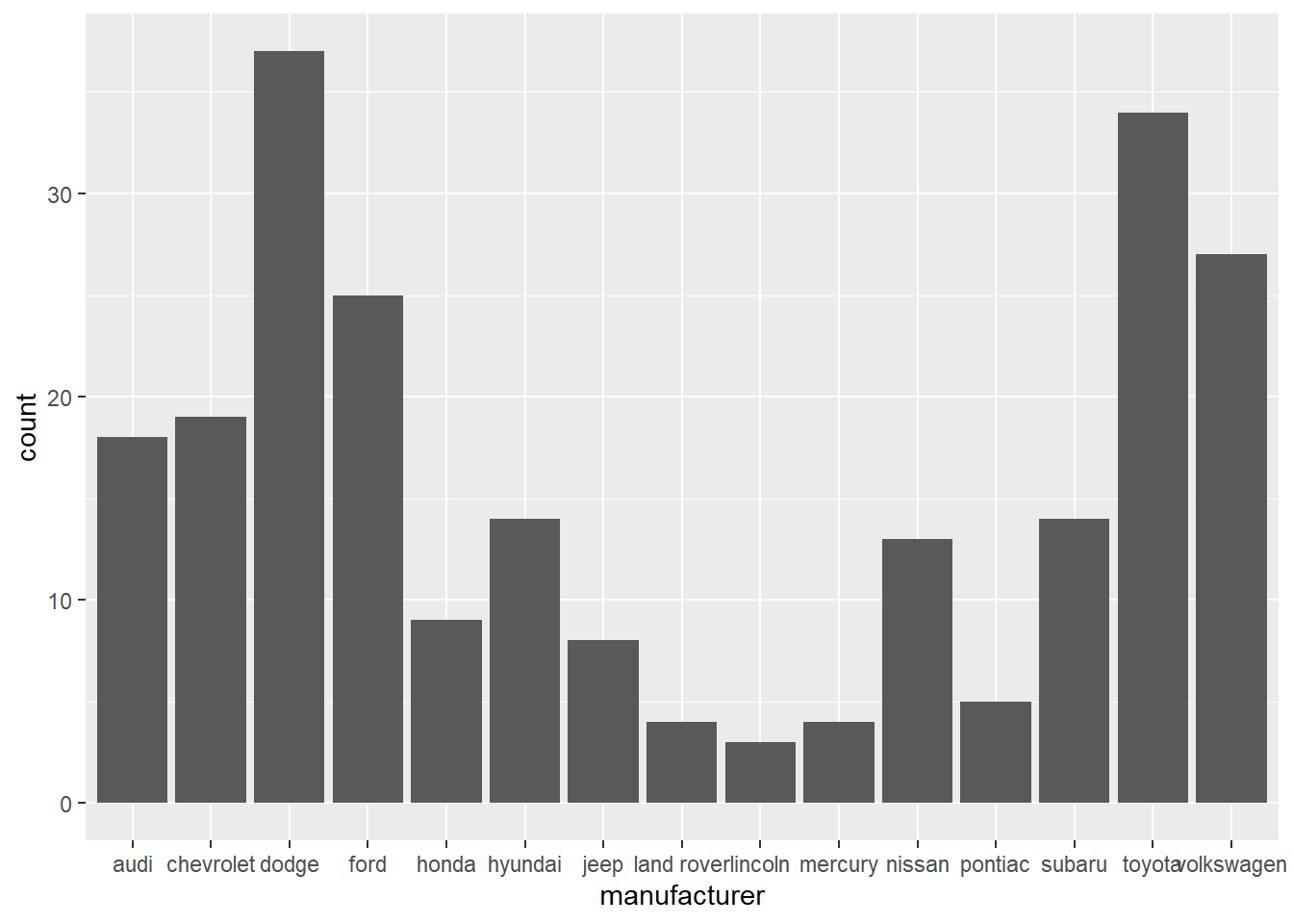
✅ YES! Names are readable
ggplot(data = mpg, aes(y = manufacturer)) +

  geom_bar()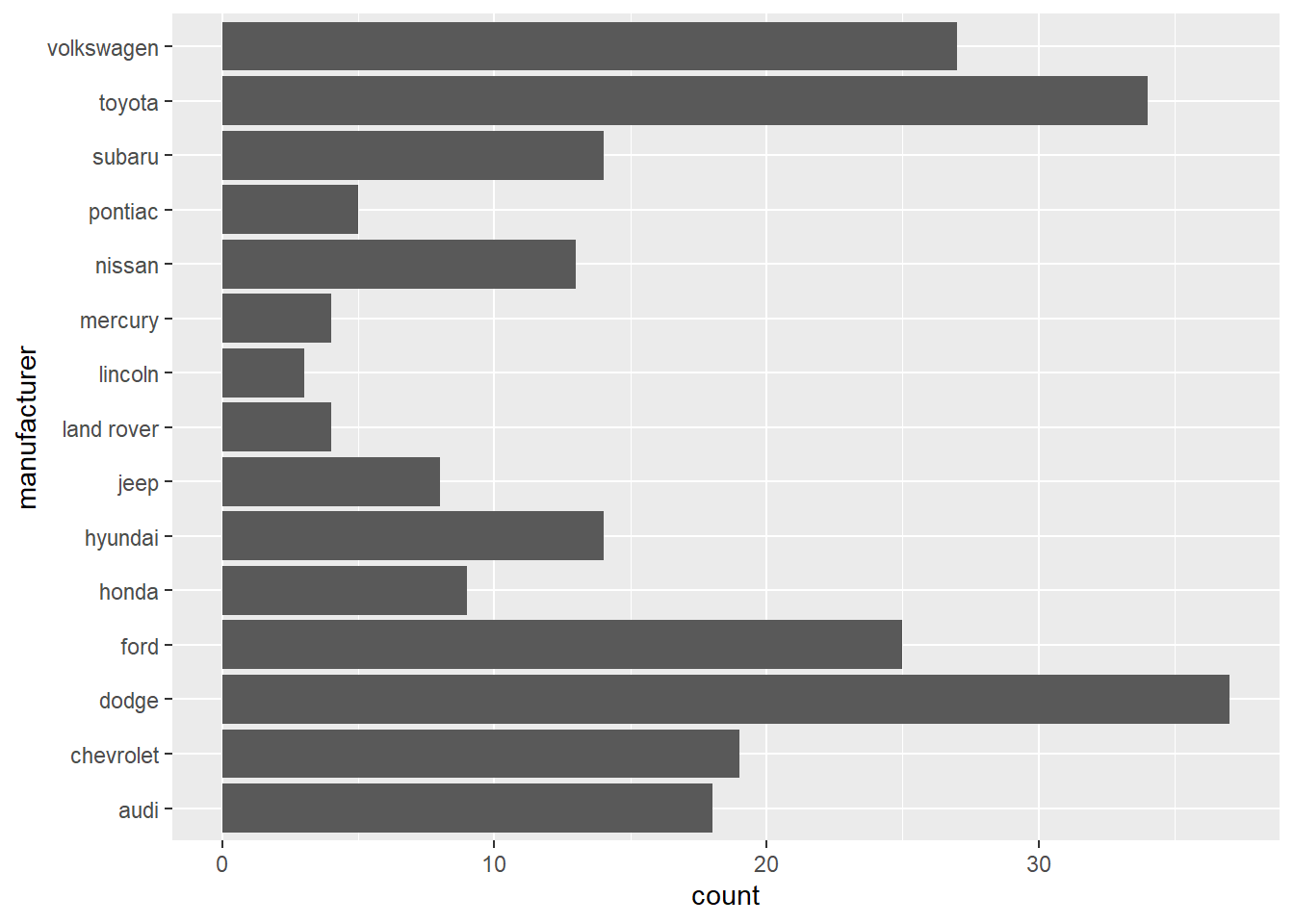
Do a little more to make the plot look professional!
Informative title and axis labels
Flipped coordinates to make names readable
Arranged bars based on count
Capitalized manufacturer names
Optional: Added color - Use a coordinated color scheme throughout paper / presentation
Optional: Applied a theme - Use same theme throughout paper / presentation
mpg %>%

  count(manufacturer) %>%

  mutate(manufacturer = str_to_title(manufacturer)) %>%

  ggplot(aes(y = fct_reorder(manufacturer,n), x = n)) +

  geom_bar(stat = "identity", fill = "steelblue") +

  labs(x = "Manufacturer",

       y = "Count",

       title = "The most common manufacturer is Dodge") +

  theme_minimal()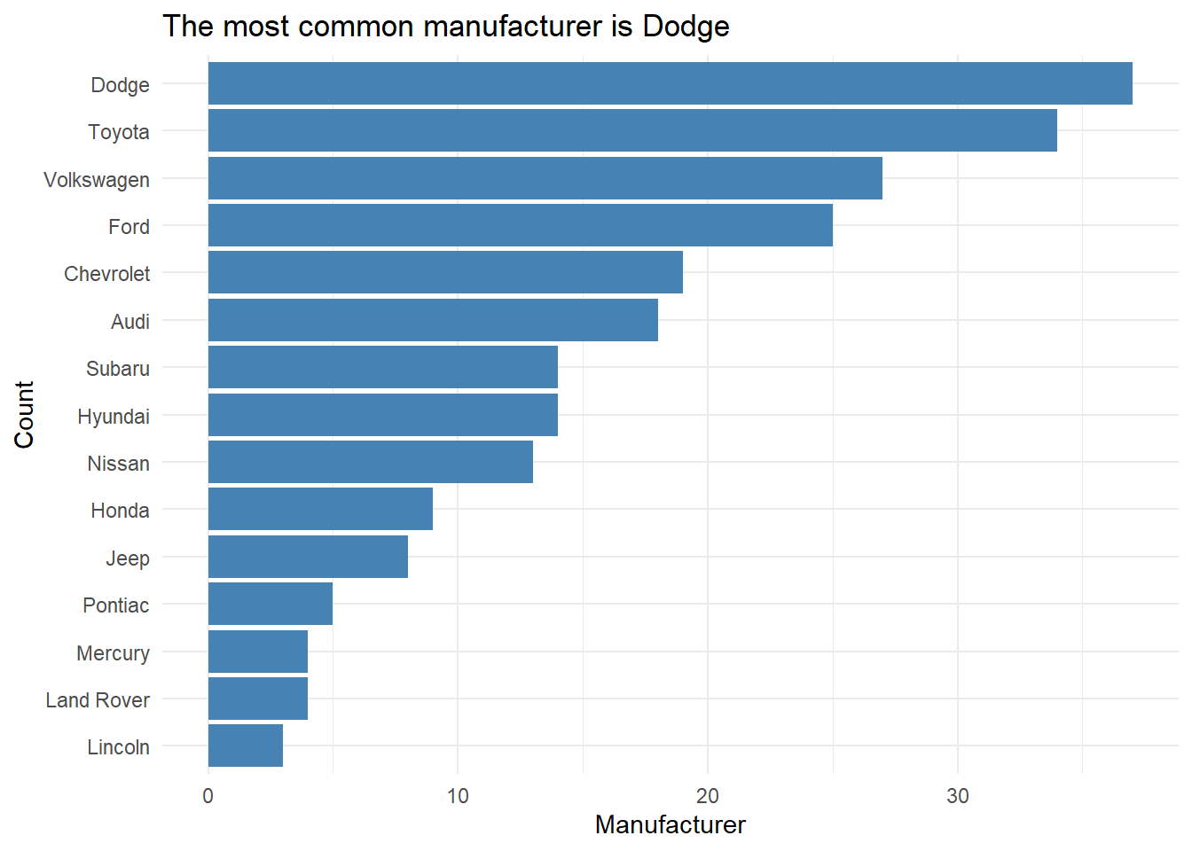
Tables and model output
Use the
kablefunction from the knitr package to neatly output all tables and model output.This will also ensure all model coefficients are displayed.
Use the
digitsargument to display only 3 or 4 significant digits.Use the
captionargument to add captions to your table.
model <- lm(mpg ~ hp, data = mtcars)

tidy(model) %>%

kable(digits = 3)| term | estimate | std.error | statistic | p.value |
|---|---|---|---|---|
| (Intercept) | 30.099 | 1.634 | 18.421 | 0 |
| hp | -0.068 | 0.010 | -6.742 | 0 |
Guidelines for communicating results
Don’t use variable names in your narrative! Use descriptive terms, so the reader understands your narrative without relying on the data dictionary.
❌ There is a negative linear relationship between mpg and hp.
✅ There is a negative linear relationship between a car’s fuel economy (in miles per gallon) and its horsepower.
Know your audience: Your report should be written for a general audience who has an understanding of statistics at the level of STA 201/DSC 223.
Avoid subject matter jargon: Don’t assume the audience knows all of the specific terminology related to your subject area.
If you must use jargon, include a brief definition the first time you introduce a term.
Tell the “so what”: Your report and presentation should be more than a list of interpretations and technical definitions.
Focus on what the results mean, i.e. what you want the audience to know about your topic after reading your report or viewing your presentation.
❌ For every one unit increase in horsepower, we expect the miles per gallon to decrease by 0.068 units, on average.
✅ If the priority is to have good fuel economy, then one should choose a car with lower horsepower. Based on our model, the fuel economy is expected to decrease, on average, by 0.68 miles per gallon for every 10 additional horsepower.
Tell a story: All visualizations, tables, model output, and narrative should tell a cohesive story!
Use one voice: Though multiple people are writing the report, it should read as if it’s from a single author.
At least one team member should read through the report before submission to ensure it reads like a cohesive document.