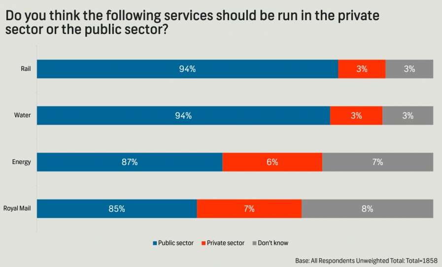
The following chart was shared by @GraphCrimes on X/Twitter on September 3, 2022.
What is misleading about this graph?
Suppose you wanted to recreate this plot, with improvements to avoid its misleading pitfalls from part (a). You would obviously need the data from the survey in order to be able to do that. How many observations would this data have? How many variables (at least) should it have, and what should those variables be?
Load the data for this survey from data/survation.csv. Confirm that the data match the percentages from the visualization. That is, calculate the percentages of public sector, private sector, don’t know for each of the services and check that they match the percentages from the plot.
Question 2
Create an improved version of the visualization. Your improved visualization:
should also be a stacked bar chart with services on the y-axis, presented in the same order as the original plot, and services to create the segments of the plot, and presented in the same order as the original plot
should have the same legend location
should have the same title and caption
does not need to have a bolded title or a gray background
How does the improved visualization look different than the original? Does it send a different message at a first glance?
Tip
Use \n to add a line break to your title. And note that since the title is very long, it might run off the page in your code. That’s ok!
Additionally, the colors used in the plot are gray, #FF3205, and #006697.
Render, commit, and push one last time. Make sure that you commit and push all changed documents and your Git pane is completely empty before proceeding.
Part 3 - DatasauRus
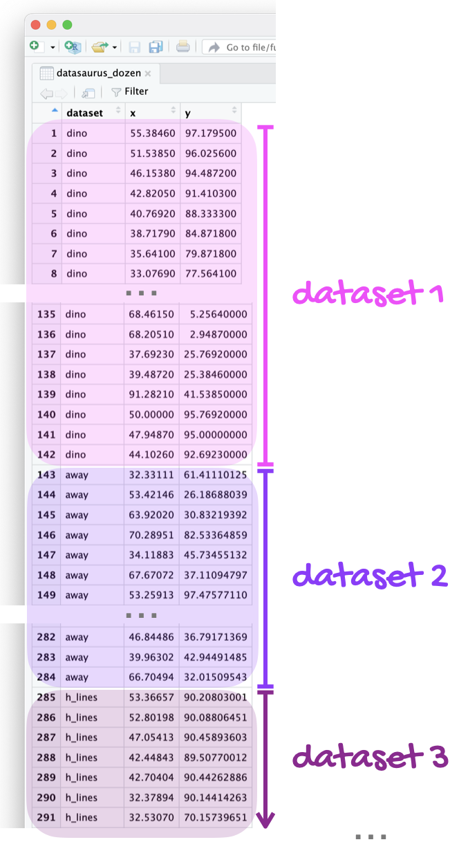
The data frame you will be working with in this part is called datasaurus_dozen and it’s in the datasauRus package. This single data frame contains 13 datasets, designed to show us why data visualization is important and how summary statistics alone can be misleading. The different datasets are marked by the dataset variable, as shown in Figure 1.
Figure 1: The `datasaurus_dozen` data frame stacks 13 datasets on top of each other. This figure shows the first three datasets.
Note
If it’s confusing that the data frame is called datasaurus_dozen when it contains 13 datasets, you’re not alone! Have you heard of a baker’s dozen?
In a single pipeline, calculate the mean of x, mean of y, standard deviation of x, standard deviation of y, and the correlation between x and y for each level of the dataset variable. Then, in 1-2 sentences, comment on how these summary statistics compare across groups (datasets).
Tip
There are 13 groups but tibbles only print out 10 rows by default. Add print(n = 13) as the last step of your pipeline to display all rows.
Question 5
Create a scatterplot of y versus x and color and facet it by dataset. Then, in 1-2 sentences, how these plots compare across groups (datasets). How does your response in this question compare to your response to the previous question and what does this say about using visualizations and summary statistics when getting to know a dataset?
Tip
When you both color and facet by the same variable, you’ll end up with a redundant legend. Turn off the legend by adding show.legend = FALSE to the geom creating the legend.
Render, commit, and push one last time. Make sure that you commit and push all changed documents and your Git pane is completely empty before proceeding.
Part 3 - Election polling
SurveyUSA polled 1,500 US adults between January 31, 2024 and February 2, 2024. Of the 1,500 adults, 1,259 were identified by SurveyUSA as being registered to vote, and of these 1,048 were found to be likely to vote in the 2024 November election for President.1 The following question was asked to these 1,048 adults:
1,048 were found to be likely to vote in the 2024 November election for President and were asked the substantive questions which follow.
Responses were broken down into the following categories:
Variable
Levels
Age
18-49; 50+
Vote
Donald Trump (R); Joe Biden (D); Undecided
Of the 1,048 responses, 507 were between the ages of 18-49. Of the individuals that are between 18-49, 238 individuals responded that they would vote for Donald Trump, 237 said they would vote for Joe Biden, and the remainder were undecided. Of the individuals that are 50+, 271 individuals responded that they would vote for Donald Trump, 228 said they would vote for Joe Biden, and the remainder were undecided.
Question 6
Fill in the code below to create a two-way table that summarizes these data.
For parts b-d below, use a your response single pipeline starting with survey_counts, calculate the desired proportions, and make sure the result is an ungrouped data frame with a column for relevant counts, a column for relevant proportions, and a column for the groups you’re interested in.
Calculate the proportions of 18-49 year olds and 50+ year olds in this sample.
Calculate the proportions of those who want to vote for Donald Trump, Joe Biden, and those who are undecided in this sample.
Calculate the proportions of individuals in this sample who are planning to vote for each of the candidates or are undecided among those who are 18-49 years old as well as among those who are 50+ years old.
Question 7
Re-create the following visualization that displays relationship between age and vote.
Tip
The colors used in the plot are "#E81B23", "#0015BC", and "gray". The theme is theme_minimal().
Based on your calculations so far, as well as your visualization, write 1-3 sentences that describe the relationship, in this sample, between age and plans for presidential vote.
Render, commit, and push one last time. Make sure that you commit and push all changed documents and your Git pane is completely empty before proceeding.