library(tidyverse)
library(scales)
library(fivethirtyeight)HW 04 - What should I major in?

The first step in the process of turning information into knowledge process is to summarize and describe the raw information - the data. In this assignment we explore data on college majors and earnings, specifically the data begin the FiveThirtyEight story “The Economic Guide To Picking A College Major”.
These data originally come from the American Community Survey (ACS) 2010-2012 Public Use Microdata Series. While this is outside the scope of this assignment, if you are curious about how raw data from the ACS were cleaned and prepared, see the code FiveThirtyEight authors used.
We should also note that there are many considerations that go into picking a major. Earnings potential and employment prospects are two of them, and they are important, but they don’t tell the whole story. Keep this in mind as you analyze the data.
Getting started
Go to the course GitHub organization and locate your homework repo, which should be named hw-04-college-majors-YOUR_GITHUB_USERNAME. Grab the URL of the repo, and clone it in RStudio. First, open the Quarto document hw-04.qmd and Render it. Make sure it compiles without errors. Look through the document and make sure the formatting looks correct.
Warm up
Before we introduce the data, let’s warm up with some simple exercises.
- Update the YAML, changing the author name to your name, and Render the document.
- Commit your changes with a meaningful commit message.
- Push your changes to GitHub.
- Go to your repo on GitHub and confirm that your changes are visible in your Rmd and md files. If anything is missing, commit and push again.
Packages
We’ll use the tidyverse package for much of the data wrangling and visualization, the scales package for better formatting of labels on visualizations, and the data lives in the fivethirtyeight package. These packages are already installed for you. You can load them by running the following in your Console:
Data
The data can be found in the fivethirtyeight package, and it’s called college_recent_grads. Since the dataset is distributed with the package, we don’t need to load it separately; it becomes available to us when we load the package. You can find out more about the dataset by inspecting its documentation, which you can access by running ?college_recent_grads in the Console or using the Help menu in RStudio to search for college_recent_grads. You can also find this information here.
You can also take a quick peek at your data frame and view its dimensions with the glimpse function.
glimpse(college_recent_grads)Rows: 173
Columns: 21
$ rank <int> 1, 2, 3, 4, 5, 6, 7, 8, 9, 10, 11, 12, 13,…
$ major_code <int> 2419, 2416, 2415, 2417, 2405, 2418, 6202, …
$ major <chr> "Petroleum Engineering", "Mining And Miner…
$ major_category <chr> "Engineering", "Engineering", "Engineering…
$ total <int> 2339, 756, 856, 1258, 32260, 2573, 3777, 1…
$ sample_size <int> 36, 7, 3, 16, 289, 17, 51, 10, 1029, 631, …
$ men <int> 2057, 679, 725, 1123, 21239, 2200, 2110, 8…
$ women <int> 282, 77, 131, 135, 11021, 373, 1667, 960, …
$ sharewomen <dbl> 0.1205643, 0.1018519, 0.1530374, 0.1073132…
$ employed <int> 1976, 640, 648, 758, 25694, 1857, 2912, 15…
$ employed_fulltime <int> 1849, 556, 558, 1069, 23170, 2038, 2924, 1…
$ employed_parttime <int> 270, 170, 133, 150, 5180, 264, 296, 553, 1…
$ employed_fulltime_yearround <int> 1207, 388, 340, 692, 16697, 1449, 2482, 82…
$ unemployed <int> 37, 85, 16, 40, 1672, 400, 308, 33, 4650, …
$ unemployment_rate <dbl> 0.018380527, 0.117241379, 0.024096386, 0.0…
$ p25th <dbl> 95000, 55000, 50000, 43000, 50000, 50000, …
$ median <dbl> 110000, 75000, 73000, 70000, 65000, 65000,…
$ p75th <dbl> 125000, 90000, 105000, 80000, 75000, 10200…
$ college_jobs <int> 1534, 350, 456, 529, 18314, 1142, 1768, 97…
$ non_college_jobs <int> 364, 257, 176, 102, 4440, 657, 314, 500, 1…
$ low_wage_jobs <int> 193, 50, 0, 0, 972, 244, 259, 220, 3253, 3…The college_recent_grads data frame is a trove of information. Let’s think about some questions we might want to answer with these data:
- Which major has the lowest unemployment rate?
- Which major has the highest percentage of women?
- How do the distributions of median income compare across major categories?
- Do women tend to choose majors with lower or higher earnings?
In the next section we aim to answer these questions.
Exercises
Which major has the lowest unemployment rate?
In order to answer this question all we need to do is sort the data. We use the arrange function to do this, and sort it by the unemployment_rate variable. By default arrange sorts in ascending order, which is what we want here – we’re interested in the major with the lowest unemployment rate.
college_recent_grads %>%
  arrange(unemployment_rate)
# A tibble: 173 × 21
rank major_code major major_category total sample_size men women
<int> <int> <chr> <chr> <int> <int> <int> <int>
1 53 4005 Mathematics An… Computers & M… 609 7 500 109
2 74 3801 Military Techn… Industrial Ar… 124 4 124 0
3 84 3602 Botany Biology & Lif… 1329 9 626 703
4 113 1106 Soil Science Agriculture &… 685 4 476 209
5 121 2301 Educational Ad… Education 804 5 280 524
6 15 2409 Engineering Me… Engineering 4321 30 3526 795
7 20 3201 Court Reporting Law & Public … 1148 14 877 271
8 120 2305 Mathematics Te… Education 14237 123 3872 10365
9 1 2419 Petroleum Engi… Engineering 2339 36 2057 282
10 65 1100 General Agricu… Agriculture &… 10399 158 6053 4346
# ℹ 163 more rows
# ℹ 13 more variables: sharewomen <dbl>, employed <int>,
# employed_fulltime <int>, employed_parttime <int>,
# employed_fulltime_yearround <int>, unemployed <int>,
# unemployment_rate <dbl>, p25th <dbl>, median <dbl>, p75th <dbl>,
# college_jobs <int>, non_college_jobs <int>, low_wage_jobs <int>This gives us what we wanted, but not in an ideal form. First, the name of the major barely fits on the page. Second, some of the variables are not that useful (e.g. major_code, major_category) and some we might want front and center are not easily viewed (e.g. unemployment_rate).
We can use the select function to choose which variables to display, and in which order:
Note how easily we expanded our code with adding another step to our pipeline, with the pipe operator: %>%.
college_recent_grads %>%
  arrange(unemployment_rate) %>%
  select(rank, major, unemployment_rate)
# A tibble: 173 × 3
rank major unemployment_rate
<int> <chr> <dbl>
1 53 Mathematics And Computer Science 0
2 74 Military Technologies 0
3 84 Botany 0
4 113 Soil Science 0
5 121 Educational Administration And Supervision 0
6 15 Engineering Mechanics Physics And Science 0.00633
7 20 Court Reporting 0.0117
8 120 Mathematics Teacher Education 0.0162
9 1 Petroleum Engineering 0.0184
10 65 General Agriculture 0.0196
# ℹ 163 more rowsOk, this is looking better, but do we really need to display all those decimal places in the unemployment variable? Not really!
We can use the percent() function to clean up the display a bit.
college_recent_grads %>%
  arrange(unemployment_rate) %>%
  select(rank, major, unemployment_rate) %>%
  mutate(unemployment_rate = percent(unemployment_rate))
# A tibble: 173 × 3
rank major unemployment_rate
<int> <chr> <chr>
1 53 Mathematics And Computer Science 0.00000%
2 74 Military Technologies 0.00000%
3 84 Botany 0.00000%
4 113 Soil Science 0.00000%
5 121 Educational Administration And Supervision 0.00000%
6 15 Engineering Mechanics Physics And Science 0.63343%
7 20 Court Reporting 1.16897%
8 120 Mathematics Teacher Education 1.62028%
9 1 Petroleum Engineering 1.83805%
10 65 General Agriculture 1.96425%
# ℹ 163 more rowsWhich major has the highest percentage of women?
To answer such a question we need to arrange the data in descending order. For example, if earlier we were interested in the major with the highest unemployment rate, we would use the following:
The desc function specifies that we want unemployment_rate in descending order.
college_recent_grads %>%
  arrange(desc(unemployment_rate)) %>%
  select(rank, major, unemployment_rate)
# A tibble: 173 × 3
rank major unemployment_rate
<int> <chr> <dbl>
1 6 Nuclear Engineering 0.177
2 90 Public Administration 0.159
3 85 Computer Networking And Telecommunications 0.152
4 171 Clinical Psychology 0.149
5 30 Public Policy 0.128
6 106 Communication Technologies 0.120
7 2 Mining And Mineral Engineering 0.117
8 54 Computer Programming And Data Processing 0.114
9 80 Geography 0.113
10 59 Architecture 0.113
# ℹ 163 more rows1. Using what you’ve learned so far, arrange the data in descending order with respect to proportion of women in a major, and display only the major, the total number of people with major, and proportion of women. Show only the top 3 majors by adding slice_max() at the end of the pipeline.
How do the distributions of median income compare across major categories?
A percentile is a measure used in statistics indicating the value below which a given percentage of observations in a group of observations fall. For example, the 20th percentile is the value below which 20% of the observations may be found. (Source: Wikipedia
There are three types of incomes reported in this data frame: p25th, median, and p75th. These correspond to the 25th, 50th, and 75th percentiles of the income distribution of sampled individuals for a given major.
2. Why do we often choose the median, rather than the mean, to describe the typical income of a group of people?
The question we want to answer “How do the distributions of median income compare across major categories?”. We need to do a few things to answer this question: First, we need to group the data by major_category. Then, we need a way to summarize the distributions of median income within these groups. This decision will depend on the shapes of these distributions. So first, we need to visualize the data.
We use the ggplot() function to do this. The first argument is the data frame, and the next argument gives the mapping of the variables of the data to the aesthetic elements of the plot.
Let’s start simple and take a look at the distribution of all median incomes, without considering the major categories.
ggplot(data = college_recent_grads, mapping = aes(x = median)) +
  geom_histogram()
`stat_bin()` using `bins = 30`. Pick better value with `binwidth`.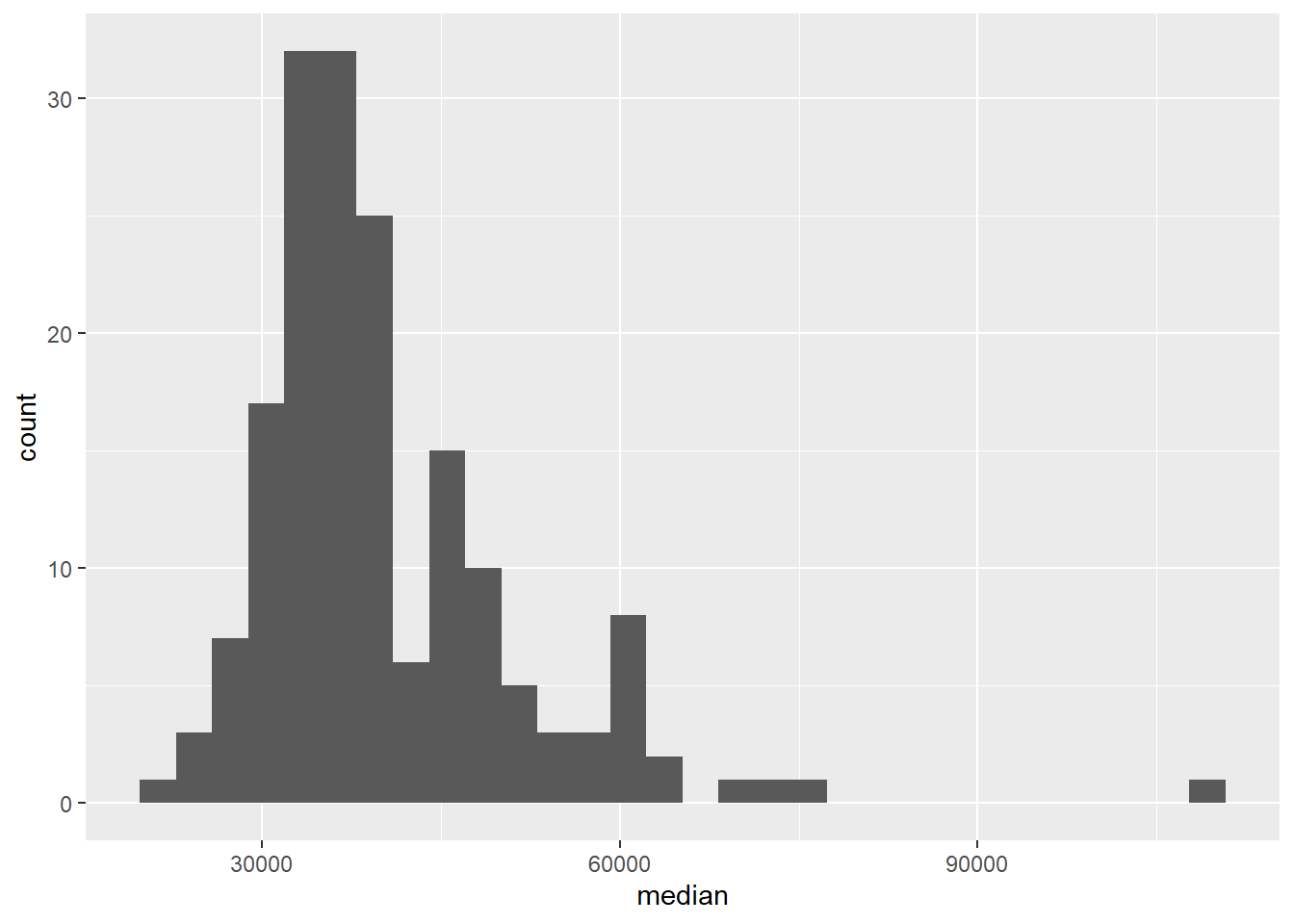
Along with the plot, we get a message:
`stat_bin()` using `bins = 30`. Pick better value with `binwidth`.This is telling us that we might want to reconsider the binwidth we chose for our histogram – or more accurately, the binwidth we didn’t specify. It’s good practice to always think in the context of the data and try out a few binwidths before settling on a binwidth. You might ask yourself: “What would be a meaningful difference in median incomes?” $1 is obviously too little, $10000 might be too high.
3. Try binwidths of $1000 and $5000 and choose one. Explain your reasoning for your choice. Note that the binwidth is an argument for the geom_histogram function. So to specify a binwidth of $1000, you would use geom_histogram(binwidth = 1000).
We can also calculate summary statistics for this distribution using the summarise function:
college_recent_grads %>%
  summarise(min = min(median), max = max(median),
            mean = mean(median), med = median(median),
            sd = sd(median),
            q1 = quantile(median, probs = 0.25),
            q3 = quantile(median, probs = 0.75))
# A tibble: 1 × 7
min max mean med sd q1 q3
<dbl> <dbl> <dbl> <dbl> <dbl> <dbl> <dbl>
1 22000 110000 40151. 36000 11470. 33000 450004. Based on the shape of the histogram you created in the previous exercise, determine which of these summary statistics is useful for describing the distribution.
Write up your description (remember shape, center, spread, any unusual observations) and include the summary statistic output as well.5. Plot the distribution of median income using a histogram, faceted by major_category.
Use the `binwidth` you chose in the earlier exercise.Now that we’ve seen the shapes of the distributions of median incomes for each major category, we should have a better idea for which summary statistic to use to quantify the typical median income.
6. Which major category has the highest typical (you’ll need to decide what this means) median income? Use the partial code below, filling it in with the appropriate statistic and function. Also note that we are looking for the highest statistic, so make sure to arrange in the correct direction.
college_recent_grads %>%
  group_by(major_category) %>%
  summarise(___ = ___(median)) %>%
  arrange(___)
7. Which major category is the least popular in this sample? To answer this question we use a new function called count, which first groups the data and then counts the number of observations in each category (see below). Add to the pipeline appropriately to arrange the results so that the major with the lowest observations is on top.
college_recent_grads %>%
  count(major_category)
# A tibble: 16 × 2
major_category n
<chr> <int>
1 Agriculture & Natural Resources 10
2 Arts 8
3 Biology & Life Science 14
4 Business 13
5 Communications & Journalism 4
6 Computers & Mathematics 11
7 Education 16
8 Engineering 29
9 Health 12
10 Humanities & Liberal Arts 15
11 Industrial Arts & Consumer Services 7
12 Interdisciplinary 1
13 Law & Public Policy 5
14 Physical Sciences 10
15 Psychology & Social Work 9
16 Social Science 9🧶 ✅ ⬆️ Render, commit, and push your changes to GitHub with an appropriate commit message. Make sure to commit and push all changed files so that your Git pane is cleared up afterwards.
All STEM fields aren’t the same
One of the sections of the FiveThirtyEight story is “All STEM fields aren’t the same”. Let’s see if this is true.
First, let’s create a new vector called stem_categories that lists the major categories that are considered STEM fields.
stem_categories <- c("Biology & Life Science",
                     "Computers & Mathematics",
                     "Engineering",
                     "Physical Sciences")
Then, we can use this to create a new variable in our data frame indicating whether a major is STEM or not.
college_recent_grads <- college_recent_grads %>%
  mutate(major_type = ifelse(major_category %in% stem_categories, "stem", "not stem"))
Let’s unpack this: with mutate we create a new variable called major_type, which is defined as "stem" if the major_category is in the vector called stem_categories we created earlier, and as "not stem" otherwise.
%in% is a logical operator. Other logical operators that are commonly used are
| Operator | Operation |
|---|---|
x < y |
less than |
x > y |
greater than |
x <= y |
less than or equal to |
x >= y |
greater than or equal to |
x != y |
not equal to |
x == y |
equal to |
x %in% y |
contains |
x | y |
or |
x & y |
and |
!x |
not |
We can use the logical operators to also filter our data for STEM majors whose median earnings is less than median for all majors’ median earnings, which we found to be $36,000 earlier.
college_recent_grads %>%
  filter(
    major_type == "stem",
    median < 36000
  )
# A tibble: 10 × 22
rank major_code major major_category total sample_size men women
<int> <int> <chr> <chr> <int> <int> <int> <int>
1 93 1301 Environment… Biology & Lif… 25965 225 10787 15178
2 98 5098 Multi-Disci… Physical Scie… 62052 427 27015 35037
3 102 3608 Physiology Biology & Lif… 22060 99 8422 13638
4 106 2001 Communicati… Computers & M… 18035 208 11431 6604
5 109 3611 Neuroscience Biology & Lif… 13663 53 4944 8719
6 111 5002 Atmospheric… Physical Scie… 4043 32 2744 1299
7 123 3699 Miscellaneo… Biology & Lif… 10706 63 4747 5959
8 124 3600 Biology Biology & Lif… 280709 1370 111762 168947
9 133 3604 Ecology Biology & Lif… 9154 86 3878 5276
10 169 3609 Zoology Biology & Lif… 8409 47 3050 5359
# ℹ 14 more variables: sharewomen <dbl>, employed <int>,
# employed_fulltime <int>, employed_parttime <int>,
# employed_fulltime_yearround <int>, unemployed <int>,
# unemployment_rate <dbl>, p25th <dbl>, median <dbl>, p75th <dbl>,
# college_jobs <int>, non_college_jobs <int>, low_wage_jobs <int>,
# major_type <chr>8. Which STEM majors have median salaries equal to or less than the median for all majors’ median earnings? Your output should only show the major name and median, 25th percentile, and 75th percentile earning for that major as and should be sorted such that the major with the highest median earning is on top.
🧶 ✅ ⬆️ Render, commit, and push your changes to GitHub with an appropriate commit message. Make sure to commit and push all changed files so that your Git pane is cleared up afterwards.
What types of majors do women tend to major in?
9. Create a scatterplot of median income vs. proportion of women in that major, coloured by whether the major is in a STEM field or not. Describe the association between these three variables.
🧶 ✅ ⬆️ Render, commit, and push your changes to GitHub with an appropriate commit message. Make sure to commit and push all changed files so that your Git pane is cleared up afterwards and review your html rendered document before committing and pushing.