library(tidyverse)
library(dsbox)HW 03 - Road traffic accidents

In this assignment we’ll look at traffic accidents in Edinburgh. The data are made available online by the UK Government. It covers all recorded accidents in Edinburgh in 2018 and some of the variables were modified for the purposes of this assignment.
Getting started
Go to the course GitHub organization and locate your homework repo, which should be named hw-03-accidents-YOUR_GITHUB_USERNAME. Grab the URL of the repo, and clone it in RStudio. First, open the Quarto document hw-03.qmd and Render it. Make sure it compiles without errors.
Warm up
Before we introduce the data, let’s warm up with some simple exercises.
- Update the YAML, changing the author name to your name, and Render the document.
- Commit your changes with a meaningful commit message.
- Push your changes to GitHub.
- Go to your repo on GitHub and confirm that your changes are visible.
Packages
We’ll use the tidyverse package for much of the data wrangling and visualization and the data lives in the dsbox package. These packages are already installed for you.
You can load them by running the following in your Console:
Data
The data can be found in the dsbox package, and it’s called accidents. Since the dataset is distributed with the package, we don’t need to load it separately; it becomes available to us when we load the package. You can find out more about the dataset by inspecting its documentation, which you can access by running ?accidents in the Console or using the Help menu in RStudio to search for accidents.
You can also find this information here.
Exercises
How many observations (rows) does the dataset have? Instead of hard coding the number in your answer, use inline code.
Run
View(accidents)in your Console to view the data in the data viewer. What does each row in the dataset represent?
🧶 ✅ ⬆️ Render, commit, and push your changes to GitHub with an appropriate commit message. Make sure to commit and push all changed files so that your Git pane is cleared up afterwards.
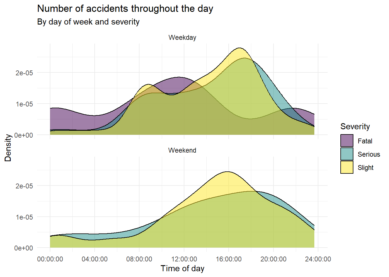
- Recreate the following plot, and describe in context of the data. In your answer, don’t forget to label your R chunk as well (where it says
label-me-1). Your label should be short, informative, shouldn’t include spaces, and shouldn’t shouldn’t repeat a previous label.
🧶 ✅ ⬆️ Render, commit, and push your changes to GitHub with an appropriate commit message. Make sure to commit and push all changed files so that your Git pane is cleared up afterwards.
- Create another data visualization based on these data and interpret it. You can choose any variables and any type of visualization you like, but it must have at least three variables, e.g. a scatterplot of x vs. y isn’t enough, but if points are colored by z, that’s fine. In your answer, don’t forget to label your R chunk as well (where it says
label-me-2).
🧶 ✅ ⬆️ Render, commit, and push your changes to GitHub with an appropriate commit message. Make sure to commit and push all changed files so that your Git pane is cleared up afterwards and review the md document on GitHub to make sure you’re happy with the final state of your work.