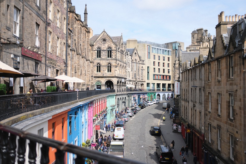
HW 02 - Airbnb listings in Edinburgh
Recent developments in Edinburgh regarding the growth of Airbnb and its impact on the housing market means a better understanding of the Airbnb listings is needed. Using data provided by Airbnb, we can explore how Airbnb availability and prices vary by neighbourhood.
Getting started
IMPORTANT: If there is no GitHub repo created for you for this assignment, it means I didn’t have your GitHub username as of when I assigned the homework. Please let me know your GitHub username asap, and I can create your repo.
Go to the course GitHub organization and locate your homework repo, which should be named hw-02-airbnb-edi-YOUR_GITHUB_USERNAME. Grab the URL of the repo, and clone it in RStudio. First, open the Quarto document hw-02.qmd and Knit it. Make sure it compiles without errors. ## Warm up
Before we introduce the data, let’s warm up with some simple exercises.
- Update the YAML, changing the author name to your name, and knit the document.
- Commit your changes with a meaningful commit message.
- Push your changes to GitHub.
- Go to your repo on GitHub and confirm that your changes are visible in your qmd file. If anything is missing, commit and push again.
Packages
We’ll use the tidyverse package for much of the data wrangling and visualization and the data lives in the dsbox package. These packages are already installed for you. You can load them by running the following in your Console:
library(tidyverse)
library(dsbox)
Data
The data can be found in the dsbox package, and it’s called edibnb. Since the dataset is distributed with the package, we don’t need to load it separately; it becomes available to us when we load the package.
You can view the dataset as a spreadsheet using the View() function. Note that you should not put this function in your Quarto document, but instead type it directly in the Console, as it pops open a new window (and the concept of popping open a window in a static document doesn’t really make sense…). When you run this in the console, you’ll see the following data viewer window pop up.
View(edibnb)You can find out more about the dataset by inspecting its documentation, which you can access by running ?edibnb in the Console or using the Help menu in RStudio to search for edibnb. You can also find this information here.
Exercises
Hint: The Quarto Quick Reference sheet has an example of inline R code that might be helpful. You can access it from the Help menu in RStudio.
- How many observations (rows) does the dataset have? Instead of hard coding the number in your answer, use inline code.
- Run
View(edibnb)in your Console to view the data in the data viewer. What does each row in the dataset represent?
🧶 ✅ ⬆️ Knit, commit, and push your changes to GitHub with an appropriate commit message. Make sure to commit and push all changed files so that your Git pane is cleared up afterwards.
Each column represents a variable. We can get a list of the variables in the data frame using the names() function.
names(edibnb)You can find descriptions of each of the variables in the help file for the dataset, which you can access by running ?edibnb in your Console.
Note: The plot will give a warning about some observations with non-finite values for price being removed. Don’t worry about the warning, it simply means that 199 listings in the data didn’t have prices available, so they can’t be plotted.
- Create a faceted histogram where each facet represents a neighbourhood and displays the distribution of Airbnb prices in that neighbourhood. Think critically about whether it makes more sense to stack the facets on top of each other in a column, lay them out in a row, or wrap them around. Along with your visualisation, include your reasoning for the layout you chose for your facets.
# Once you fill in, change eval argument
ggplot(data = ___, mapping = aes(x = ___)) +
  geom_histogram(binwidth = ___) +
  facet_wrap(~___)
Let’s de-construct this code:
ggplot()is the function we are using to build our plot, in layers.- In the first layer we always define the data frame as the first argument. Then, we define the mappings between the variables in the dataset and the aesthetics of the plot (e.g. x and y coordinates, colours, etc.).
- In the next layer we represent the data with geometric shapes, in this case with a histogram. You should decide what makes a reasonable bin width for the histogram by trying out a few options.
- In the final layer we facet the data by neighbourhood.
🧶 ✅ ⬆️ Knit, commit, and push your changes to GitHub with an appropriate commit message. Make sure to commit and push all changed files so that your Git pane is cleared up afterwards.
Use a single pipeline to identity the neighborhoods with the top five median listing prices. Then, in another pipeline filter the data for these five neighborhoods and make ridge plots (lookup ggridges package by calling in the library and then using ??ggridges) of the distributions of listing prices in these five neighborhoods. In a third pipeline calculate the minimum, mean, median, standard deviation, IQR, and maximum listing price in each of these neighborhoods. Use the visualization and the summary statistics to describe the distribution of listing prices in the neighborhoods. (Your answer will include three pipelines, one of which ends in a visualization, and a narrative.)
Create a visualization that will help you compare the distribution of review scores (
review_scores_rating) across neighborhoods. You get to decide what type of visualization to create and there is more than one correct answer! In your answer, include a brief interpretation of how Airbnb guests rate properties in general and how the neighborhoods compare to each other in terms of their ratings.
🧶 ✅ ⬆️ Knit, commit, and push your changes to GitHub with an appropriate commit message. Make sure to commit and push all changed files so that your Git pane is cleared up afterwards and review the files on Github.