library(countdown)
library(plotly)
library(ggiraph)
library(tidyverse)
library(tidycensus)
library(sf)
library(leaflet)
library(openintro)
library(patchwork)Interactive Visualizations
Application exercise
In this application exercise we will be studying penguins. The data can be found in the tidycensus and openintro packages. We will use tidyverse and additional packages for making interactive visualizations (ggiraph, plotly, shiny) and maps (leaflet, sf). Lastly, library patchwork is used to show it off.
Part 1: Making Plots Interactive
df_hist<-
duke_forest |>
  mutate(garage = if_else(str_detect(parking, "Garage"), "Garage", "No garage")) |>
  ggplot(aes(x = price, fill = garage)) +
  geom_histogram() +
  facet_wrap(~garage, ncol = 1) +
  labs(
    x = "Price in $",
    y = "",
    title = "Histogram of Price of Homes by Garage or not",
    fill = "Garage or not"
)df_scatter<-
ggplot(
duke_forest,
aes(x = area, y = price, color = year_built)) +
geom_point(size = 3) +
geom_smooth(se = FALSE) +
labs(
x = "Area of Home",
y = "Price of Home",
title = "Relationship between Price and Area by Year Built",
color = "Year Built"
)df_hist | df_scatter # The | puts them next to each other`stat_bin()` using `bins = 30`. Pick better value with `binwidth`.
`geom_smooth()` using method = 'loess' and formula = 'y ~ x'Warning: The following aesthetics were dropped during statistical transformation:
colour.
ℹ This can happen when ggplot fails to infer the correct grouping structure in
the data.
ℹ Did you forget to specify a `group` aesthetic or to convert a numerical
variable into a factor?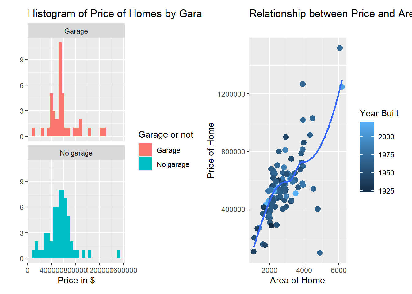
# See https://patchwork.data-imaginist.com/articles/patchwork.htmlggiraph
Demo: In AE 02 about Houses around Duke we worked with the data dukeforest. If you don’t remember this data, use
?dukeforest. We want to make the above histogram interactive using functions from ggiraph.Your turn: Make the scatterplot interactive using functions from ggiraph.
plotly
Demo: Make the histogram interactive using plotly
Your turn: Make the scatterplot interactive using functions from plotly.
Part 2: A Shiny Experience
Demo: We want to setup and
launchour first Shiny app using the ShinyServer on campus.Your turn: Make the scatterplot interactive using functions from plotly.
Part 3: Maps!
Your turn: Get a Free Census API Key
Wait for the email
Then run the chunk. Note that eval is set to false so when you render this chunk will not render again (which is what you want to happen)
Demo: Pick one or more variables from the sf1 table, then get that census information for a geographical area in 2010.
Demo: Make a map with the data using the correct geography. Then make it look nice.
Your turn: Choose your own variables of interest. Try and pick 2 and make sure they are grouped the same. For example, if one is
total householdsyou don’t want the other to betotal households by racebut you might want totalhouseholds renters.Your turn: Make a map with the data using the correct geography. Then make it look nice.