Enter Interactive
Cornell College
DSC 223 - Spring 2024 Block 7
Goals
- Make ggplots interactive with
ggigraph - Create plotly plots
- Create static and leaflet maps
- Creating shiny apps
Setup
Interactive!
Back to the midwest
Recall the
midwestdata from the start of the block. The data contains demographic characteristics of counties in the Midwest region of the United States.In lab 2, you looked at the following scatter plot of percentage below poverty vs. percentage of people with a college degree, where the color and shape of points are determined by
statewhere you were asked to identify at least one county that is a clear outlier by name.You were asked to to zoom in using coordinate functions or filters.
What if we could just hover over the point and see the information we wanted?
Our plot before

A girafe enters the room?
ggiraph is an R package and a tool that allows you to create dynamic ggplot graphs.
- add tooltips
- hover effects
- JavaScript actions
- Works with Shiny
Making the girafe work for us
Interactivity is added to ggplot geometries, legends and theme elements, via the following aesthetics:
- tooltip: tooltips to be displayed when mouse is over elements.
- onclick: JavaScript function to be executed when elements are clicked.
- data_id: id to be associated with elements (used for hover and click actions)
Converting our ggplot
Instead of using
geom_point->geom_point_interactivegeom_sf->use geom_sf_interactiveProvide at least one of the aesthetics tooltip, data_id and onclick to create interactive elements.
There are many options. See here.
Current Midwest plot
mplot<-  ggplot(
  midwest,
  aes(
    x = percollege, y = percbelowpoverty,
    color = state, shape = state
  )
) +
  geom_point() +
  labs(
    title = "Percentage with a college degree versus poverty rate",
    subtitle = "by State in the Midwest",
    x = "% college educated",
    y = "% below poverty",
    color = "State", shape = "State"
  ) +
  theme_minimal()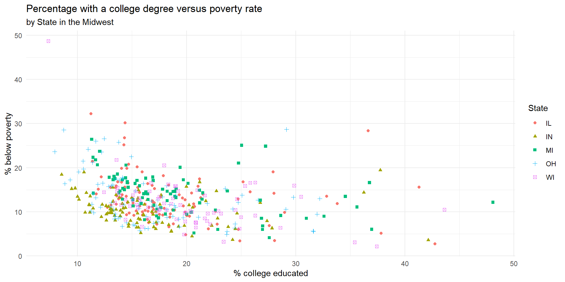
Let it move!
mplot_int<-  ggplot(
  midwest,
  aes(
    x = percollege, y = percbelowpoverty,
    color = state, shape = state,
    tooltip = county
  )
) +
  geom_point_interactive() +
  labs(
    title = "Percentage with a college degree versus poverty rate",
    subtitle = "by State in the Midwest",
    x = "% college educated",
    y = "% below poverty",
    color = "State", shape = "State"
  ) +
theme_minimal()Plotly
Another option for interactive plots that has its own functions is plotly.
It also allows making ggplots interactive
You can see a variety of examples here.
Plotly this time
Let’s use plotly this time to make our midwest plot interactive!
much wow!
Shiny
Shiny is an open source R package that provides an elegant and powerful web framework for building web applications using R.
Shiny boasts “Easy web apps for data science without the compromises” and “No web development skills required”
It is the most complex way to make an interactive visualization but also supports extraordinary, production quality dashboards.
Shiny Dahsboard Examples
Shiny Help
Create our first Shiny app!
Maps
What about maps?
Multiple of these examples involved interactive maps.
Most approaches to maps in R work similar, in concept, to ggplot, the first layer is the map and then we add layers
Next you might add points, lines, or fill regions.
The most common file type for maps is
shapefiles. These are essentially coordinates of points that define polygons.Different maps use different projections
Spatial data in R
There are two main packages for dealing with vector spatial data in R: sp and sf.
sp has been around since 2005, and thus has a rich ecosystem of tools built on top of it. However, it uses a rather complex data structure, which can make it challenging to use.
sf is newer (first released in 2016!) so it doesn’t have such a rich ecosystem. However, it’s much easier to use and fits in very naturally with the tidyverse. The trend is shifting towards the use of sf as the primary spatial package.
Mapping in R
- Why sf?
- The data read in is tidy!
- We can
wrangleit however you want
- In mapping,
geom_sf()is<GEOM_FUNCTION>(). Unlike with functions likegeom_histogram()andgeom_boxplot(), we don’t specify an x and y axis. Instead you usefillif you want to map a variable or color to just map boundaries.
tidycensus
We are going to work with census data in R.
We can use the library,
tidycensusbut in order to do so we need a census API key.Sign up free here.
Getting data
- Set your key (comment out after you run it)
get_decennial(), requests data from the US Decennial Census APIs for 2000, 2010, and 2020.- We can see more with:
- We need to pick geography and variables
Picking Variables
We need to specify what variables we want. There are many!
These variables include total population and housing units; race and ethnicity; voting-age population; and group quarters population.
The only geographies available in 2000 are “state”, “county”, “county subdivision”, “tract”, “block group”, and “place”.
Picking Variables
- There is a built-in function for finding variable name and code label lookup. We can use
load_variables()but it has two required arguments:- year, which takes the year or endyear of the Census dataset
- dataset, which references the dataset name.
- For the 2000 or 2010 Decennial Census, use “sf1” or “sf2” as the dataset name to access variables from Summary Files 1 and 2
- See https://api.census.gov/data.html for full list of tables
2010, Sf1, Varibles
# A tibble: 6 × 3
name label concept
<chr> <chr> <chr>
1 H001001 Total HOUSING UNITS
2 H002001 Total URBAN AND RURAL
3 H002002 Total!!Urban URBAN AND RURAL
4 H002003 Total!!Urban!!Inside urbanized areas URBAN AND RURAL
5 H002004 Total!!Urban!!Inside urban clusters URBAN AND RURAL
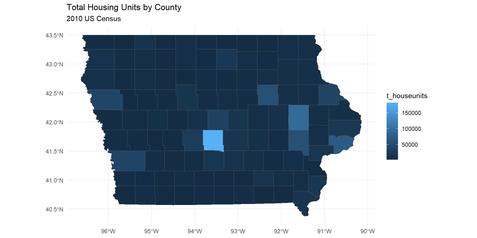
6 H002005 Total!!Rural URBAN AND RURALGeography - Iowa
- Now we have all 2010 variable data we can pick them by
name - Lets pick out the total housing units,
H001001
ia <- get_decennial(geography = "county",
        year = 2010,
        variables = c(t_houseunits = "H001001"),
        state = "IA",
        output = "wide",
        geometry = T,
        cache_table = T)
Getting data from the 2010 decennial CensusDownloading feature geometry from the Census website. To cache shapefiles for use in future sessions, set `options(tigris_use_cache = TRUE)`.Using Census Summary File 1
  |
  |                                                                                |   0%
  |
  |                                                                                |   1%
  |
  |=                                                                               |   1%
  |
  |=                                                                               |   2%
  |
  |==                                                                              |   2%
  |
  |==                                                                              |   3%
  |
  |===                                                                             |   3%
  |
  |===                                                                             |   4%
  |
  |====                                                                            |   5%
  |
  |=====                                                                           |   6%
  |
  |=====                                                                           |   7%
  |
  |======                                                                          |   7%
  |
  |======                                                                          |   8%
  |
  |=======                                                                         |   8%
  |
  |=======                                                                         |   9%
  |
  |========                                                                        |  10%
  |
  |========                                                                        |  11%
  |
  |=========                                                                       |  11%
  |
  |=========                                                                       |  12%
  |
  |==========                                                                      |  12%
  |
  |==========                                                                      |  13%
  |
  |===========                                                                     |  13%
  |
  |===========                                                                     |  14%
  |
  |============                                                                    |  15%
  |
  |=============                                                                   |  16%
  |
  |==============                                                                  |  17%
  |
  |==============                                                                  |  18%
  |
  |===============                                                                 |  19%
  |
  |================                                                                |  20%
  |
  |==================                                                              |  22%
  |
  |==================                                                              |  23%
  |
  |===================                                                             |  24%
  |
  |====================                                                            |  26%
  |
  |======================                                                          |  28%
  |
  |========================                                                        |  30%
  |
  |=========================                                                       |  31%
  |
  |=========================                                                       |  32%
  |
  |==========================                                                      |  33%
  |
  |===========================                                                     |  34%
  |
  |============================                                                    |  35%
  |
  |============================                                                    |  36%
  |
  |=============================                                                   |  37%
  |
  |==============================                                                  |  37%
  |
  |===============================                                                 |  39%
  |
  |================================                                                |  40%
  |
  |==================================                                              |  42%
  |
  |===============================================                                 |  58%
  |
  |===============================================                                 |  59%
  |
  |==========================================================                      |  73%
  |
  |============================================================                    |  75%
  |
  |================================================================                |  80%
  |
  |==================================================================              |  83%
  |
  |========================================================================        |  90%
  |
  |===========================================================================     |  94%
  |
  |=============================================================================   |  96%
  |
  |==============================================================================  |  98%
  |
  |=============================================================================== |  98%
  |
  |================================================================================| 100%
Iowa Counties Geography
Simple feature collection with 6 features and 3 fields
Geometry type: MULTIPOLYGON
Dimension:     XY
Bounding box:  xmin: -96.49844 ymin: 40.57992 xmax: -91.60399 ymax: 43.5008
Geodetic CRS:  NAD83
# A tibble: 6 × 4
  GEOID NAME                    t_houseunits                                      geometry
  <chr> <chr>                          <dbl>                            <MULTIPOLYGON [°]>
1 19185 Wayne County, Iowa              3212 (((-93.32776 40.58061, -93.34544 40.58051, -…
2 19187 Webster County, Iowa           17035 (((-94.43197 42.47336, -94.44303 42.47338, -…
3 19189 Winnebago County, Iowa          5194 (((-93.85226 43.49955, -93.79579 43.49952, -…
4 19191 Winneshiek County, Iowa         8721 (((-91.79062 43.50076, -91.77929 43.5008, -9…
5 19193 Woodbury County, Iowa          41484 (((-96.38065 42.44687, -96.38011 42.45149, -…
6 19195 Worth County, Iowa              3548 (((-93.22606 43.49957, -93.2011 43.49957, -9…
First Map
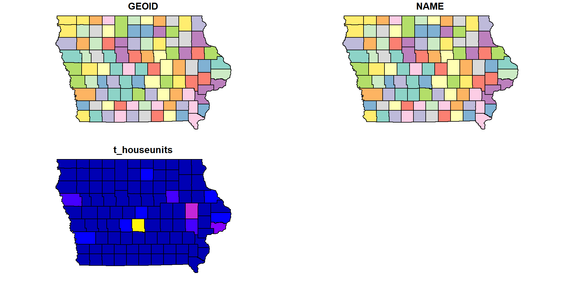
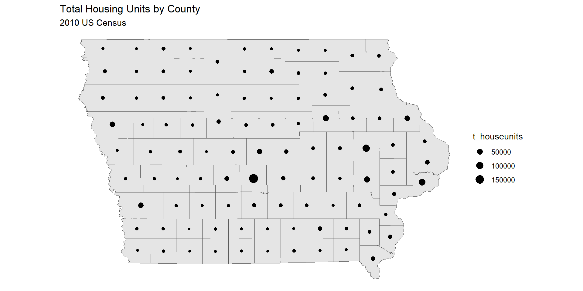
What are these plots? What did it do?
Ok, let’s at least use ggplot
ggplot_2
Choropleth Maps
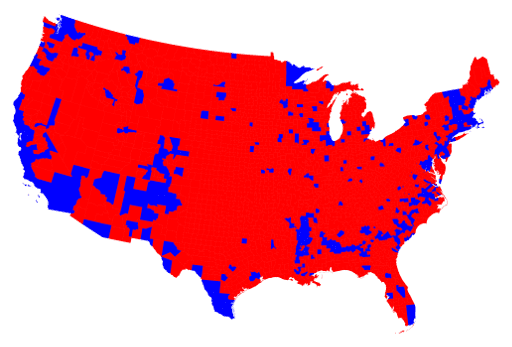
- Distort data and lead to misinterpretation. Why?
When used for items people or counts within a geographical area:
viewers associate the size of the land area rather than the counts
Filling a region with a uniform color shade implies uniformity counts across the region
US Presidential Election 2016
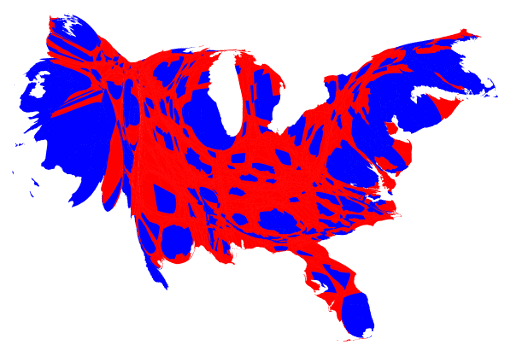
Cartogram Map
ggplot round 3 - code
ia_ggplot_map3 <-
  ia |>
    mutate(centroid = st_coordinates(st_centroid(geometry))) |>
    ggplot() +
      geom_sf() +
      geom_point(aes(x=centroid[,1],y=centroid[,2],
                     size=t_houseunits))+
          labs(title = "Total Housing Units by County",
               subtitle = "2010 US Census")+
          theme_void()+
    scale_size_continuous(range = c(1, 5))
ggplot - Good Map
Leaflet
Leaflet is the leading open-source JavaScript library for mobile-friendly interactive maps. Weighing just about 42 KB of JS, it has all the mapping features most developers ever need.
Leaflet was created 11 years ago by Volodymyr Agafonkin, a Ukrainian citizen living in Kyiv.
Works in layers like ggplot!
Make a Leaflet map - Code
ia_wgs84 <- ia |> st_transform(crs = 4326) |>
  mutate(centroid = st_centroid(geometry))

ia_leaf <-
  ia_wgs84  |>
  leaflet() %>%
  addPolygons(color = "gray",
              weight = 1,
              smoothFactor = 0.5,
              opacity = 1.0,
              fillOpacity = 0.5,
              highlightOptions =
                highlightOptions(color = "white",
                                  weight = 2,
                                  bringToFront = TRUE))
Leaflet Map
Leaflet Round 2 - Code
Leaflet - Better Map
Leaflet Round 3 - Code
ia_leaf3 <-
  ia_wgs84 |>
  leaflet() %>%
  addPolygons( color = "green",
              weight = 1,
              smoothFactor = 0.5,
              opacity = 1.0,
              fillOpacity = 0.5,
              highlightOptions =
                highlightOptions(color = "white",
                                  weight = 2,
                                  bringToFront = TRUE)) %>%
  leaflet::addCircleMarkers(lat = ~st_coordinates(centroid)[,"Y"],
                      lng = ~st_coordinates(centroid)[,"X"],
                      radius = ~t_houseunits/50000,
                      popup = ~NAME,
                      fillOpacity = 1,
                      opacity = 1)