Visualizing various types of data
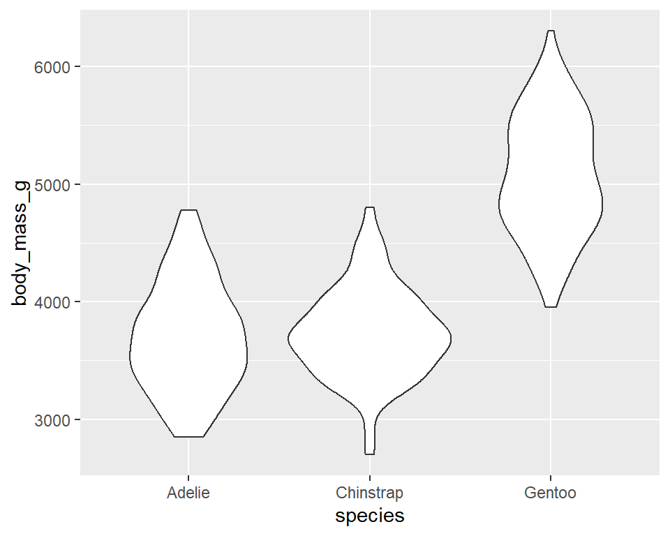
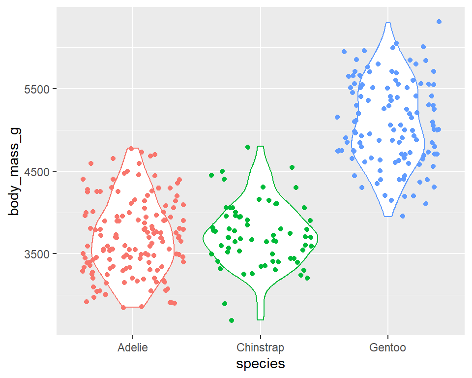
Violin plots
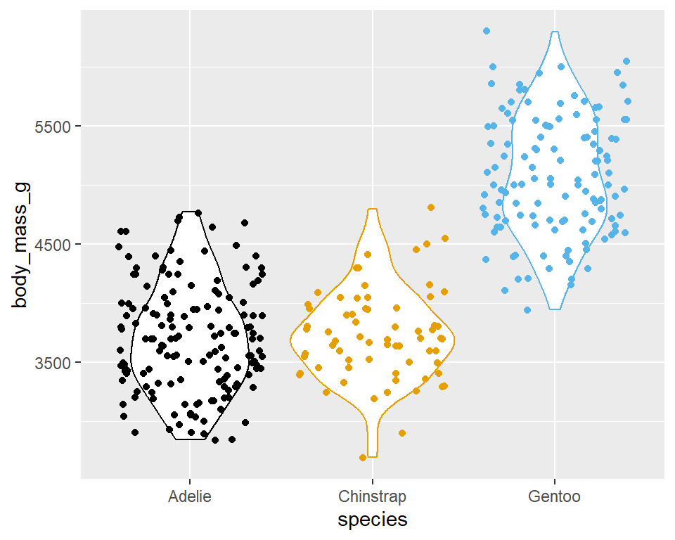
Multiple geoms
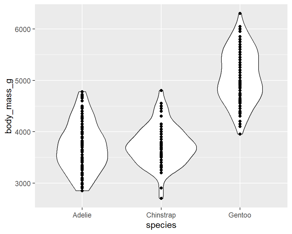
Multiple geoms
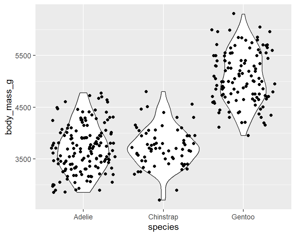
Multiple geoms + aesthetics
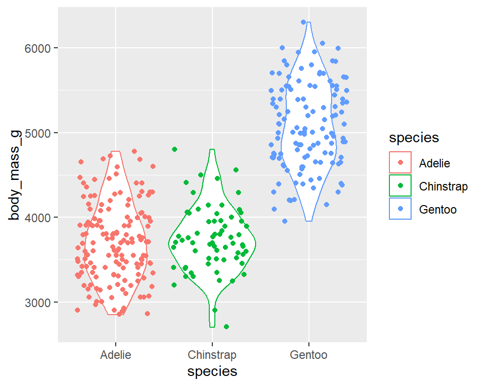
Multiple geoms + aesthetics
Multiple geoms + aesthetics
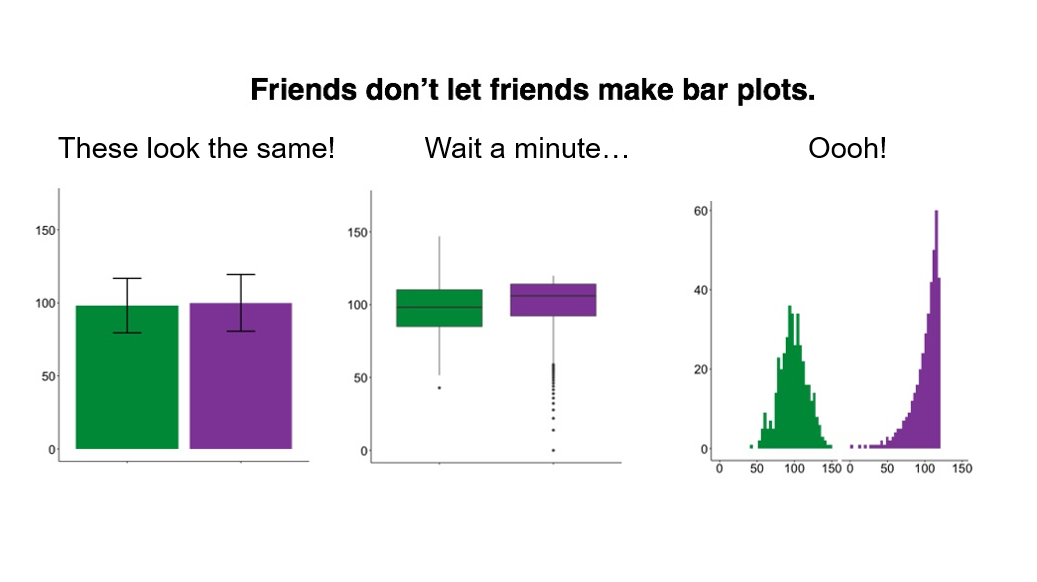
The way data is displayed matters
What do these three plots show?
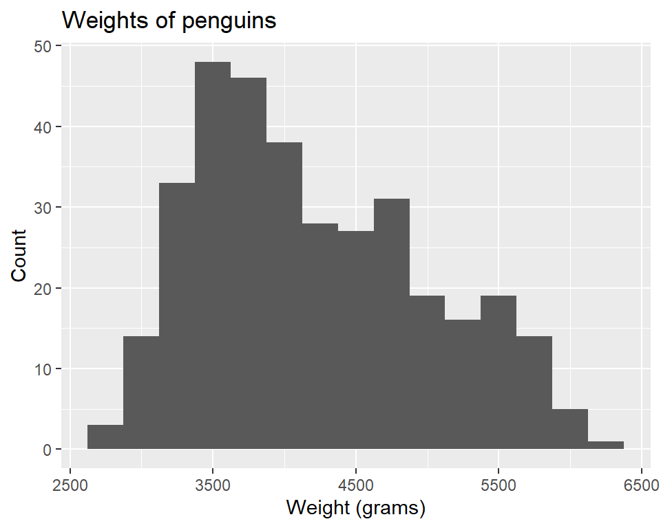
Visualizing penguins
# A tibble: 344 × 8
   species island   bill_length_mm bill_depth_mm flipper_length_mm body_mass_g sex    year
   <fct>   <fct>             <dbl>         <dbl>             <int>       <int> <fct> <int>
 1 Adelie  Torgers…           39.1          18.7               181        3750 male   2007
 2 Adelie  Torgers…           39.5          17.4               186        3800 fema…  2007
 3 Adelie  Torgers…           40.3          18                 195        3250 fema…  2007
 4 Adelie  Torgers…           NA            NA                  NA          NA <NA>   2007
 5 Adelie  Torgers…           36.7          19.3               193        3450 fema…  2007
 6 Adelie  Torgers…           39.3          20.6               190        3650 male   2007
 7 Adelie  Torgers…           38.9          17.8               181        3625 fema…  2007
 8 Adelie  Torgers…           39.2          19.6               195        4675 male   2007
 9 Adelie  Torgers…           34.1          18.1               193        3475 <NA>   2007
10 Adelie  Torgers…           42            20.2               190        4250 <NA>   2007
# ℹ 334 more rows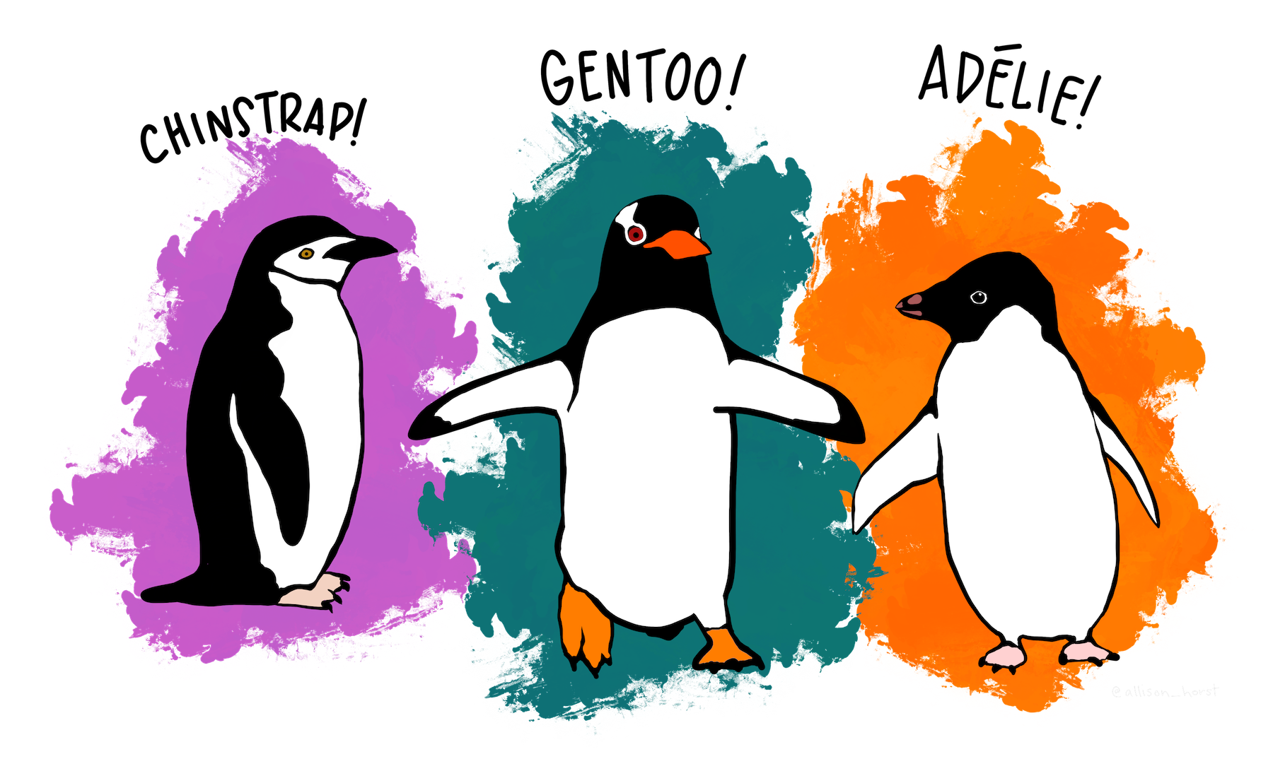
Histogram - Step 1

Histogram - Step 2

Histogram - Step 3
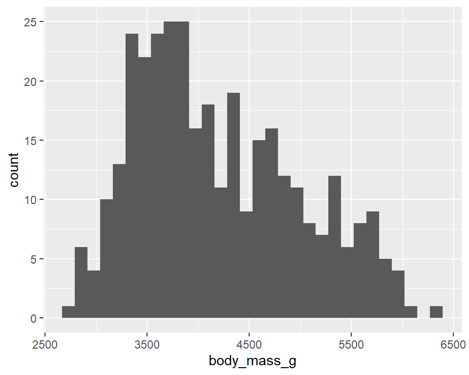
Histogram - Step 4
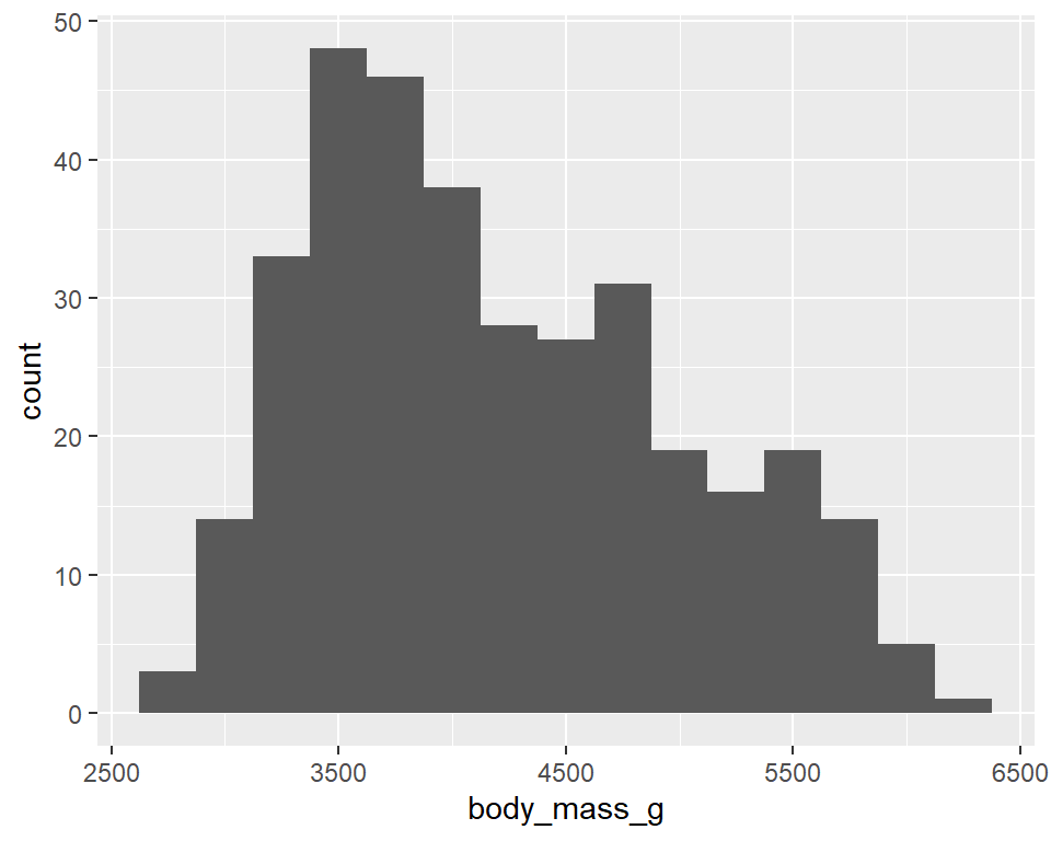
Histogram - Step 5
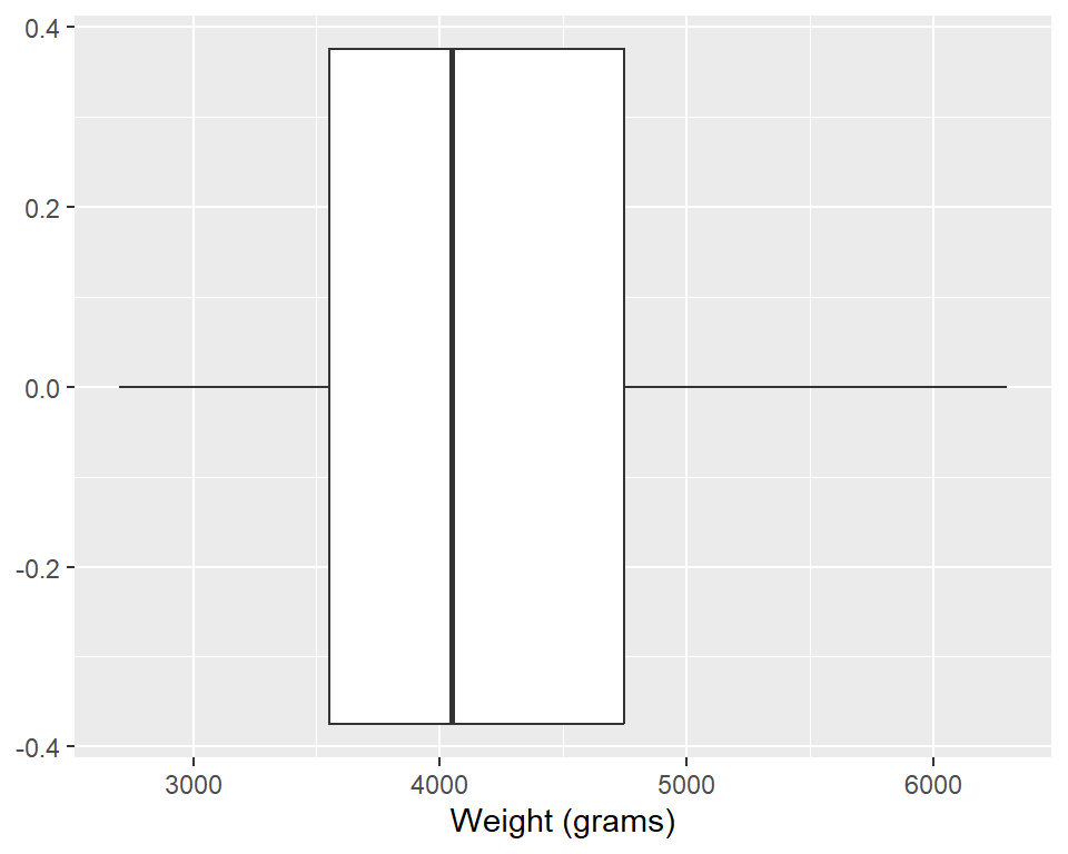
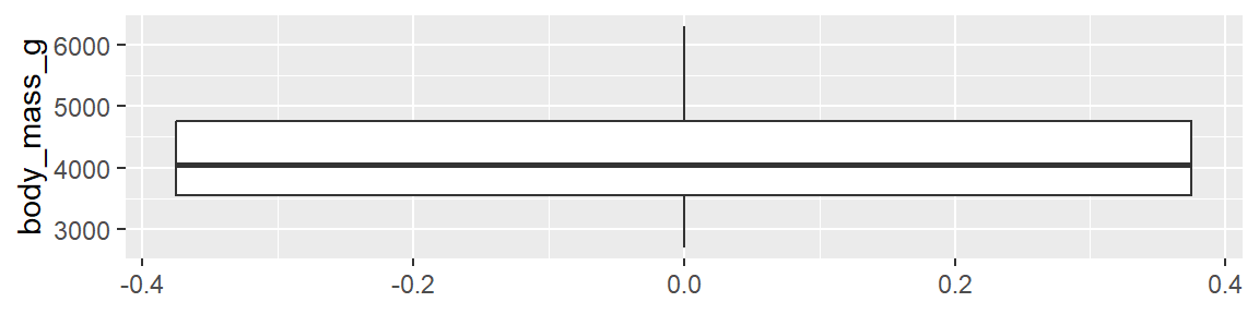
Boxplot - Step 1

Boxplot - Step 2

Boxplot - Step 3
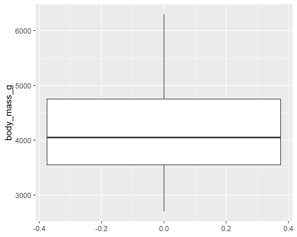
Boxplot - Step 4
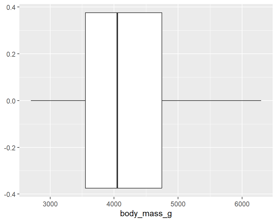
Boxplot - Step 5
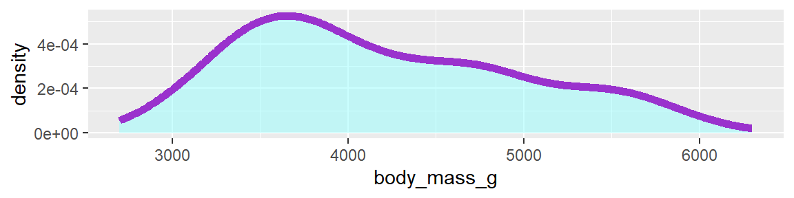
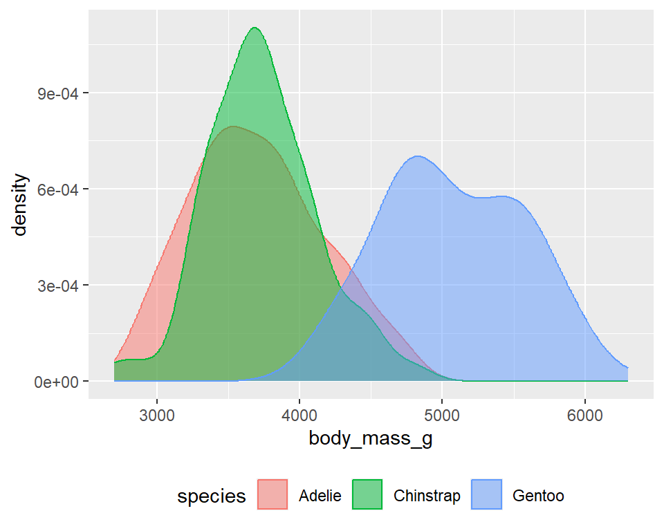
Density plot - Step 1

Density plot - Step 2
Density plot - Step 3
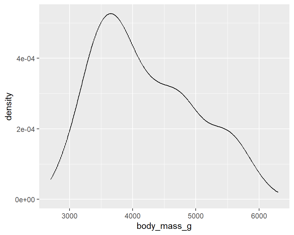
Density plot - Step 4
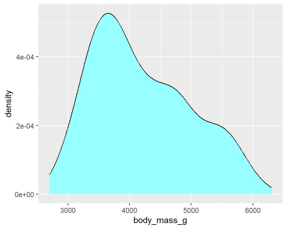
Density plot - Step 5
Density plot - Step 6
Density plot - Step 7
Weights of penguins
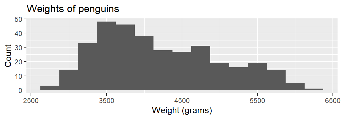
TRUE / FALSE
- The distribution of penguin weights in this sample is left skewed.
- The distribution of penguin weights in this sample is unimodal.
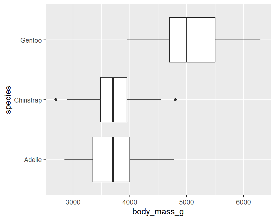
Side-by-side box plots
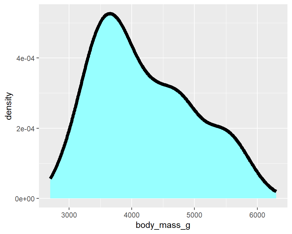
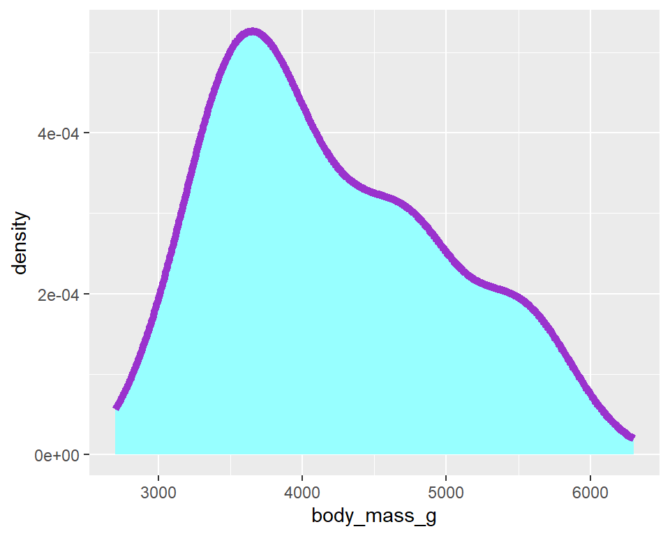
Density plots
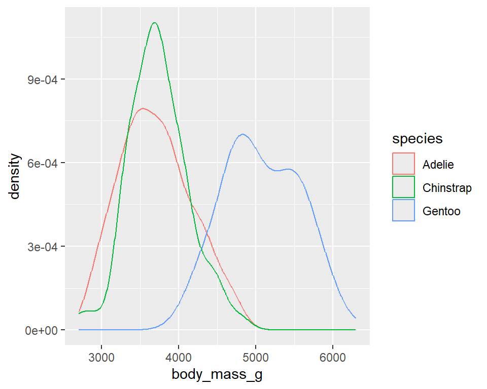
Density plots
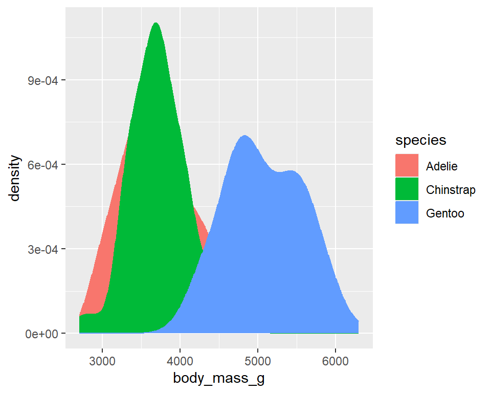
Density plots
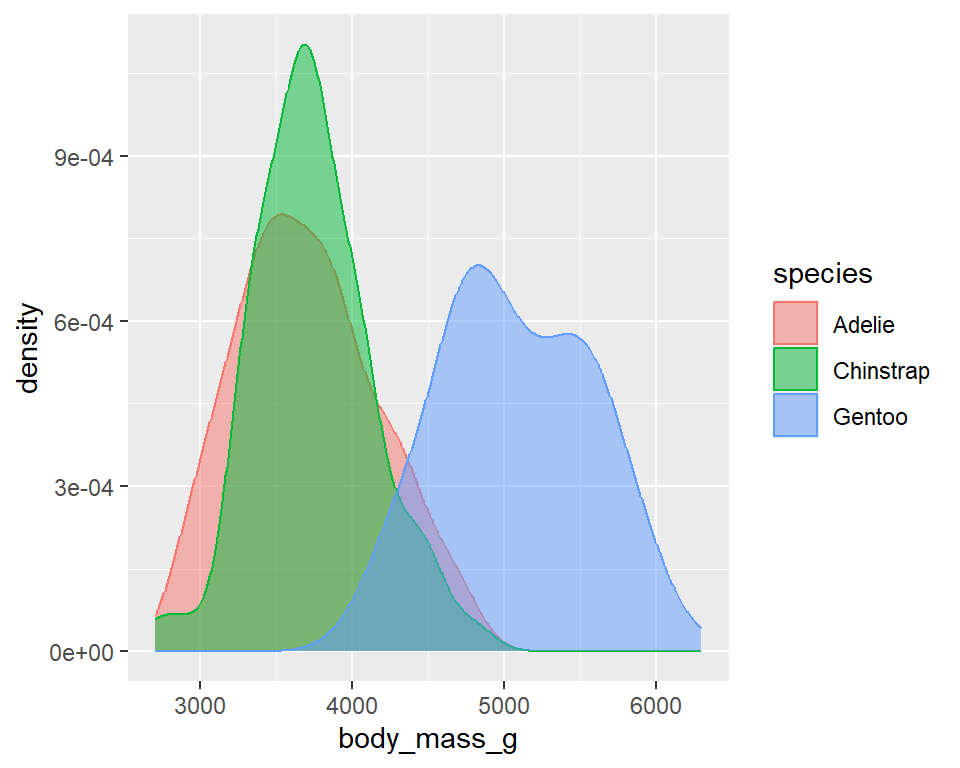
Density plots
![]()